


2020
Color, Material & Finish
Client : 1518 / Japan
Product Designer : Ryota Yokozeki
Assistant Designer : Haruka Imai, Beatriz Filipe
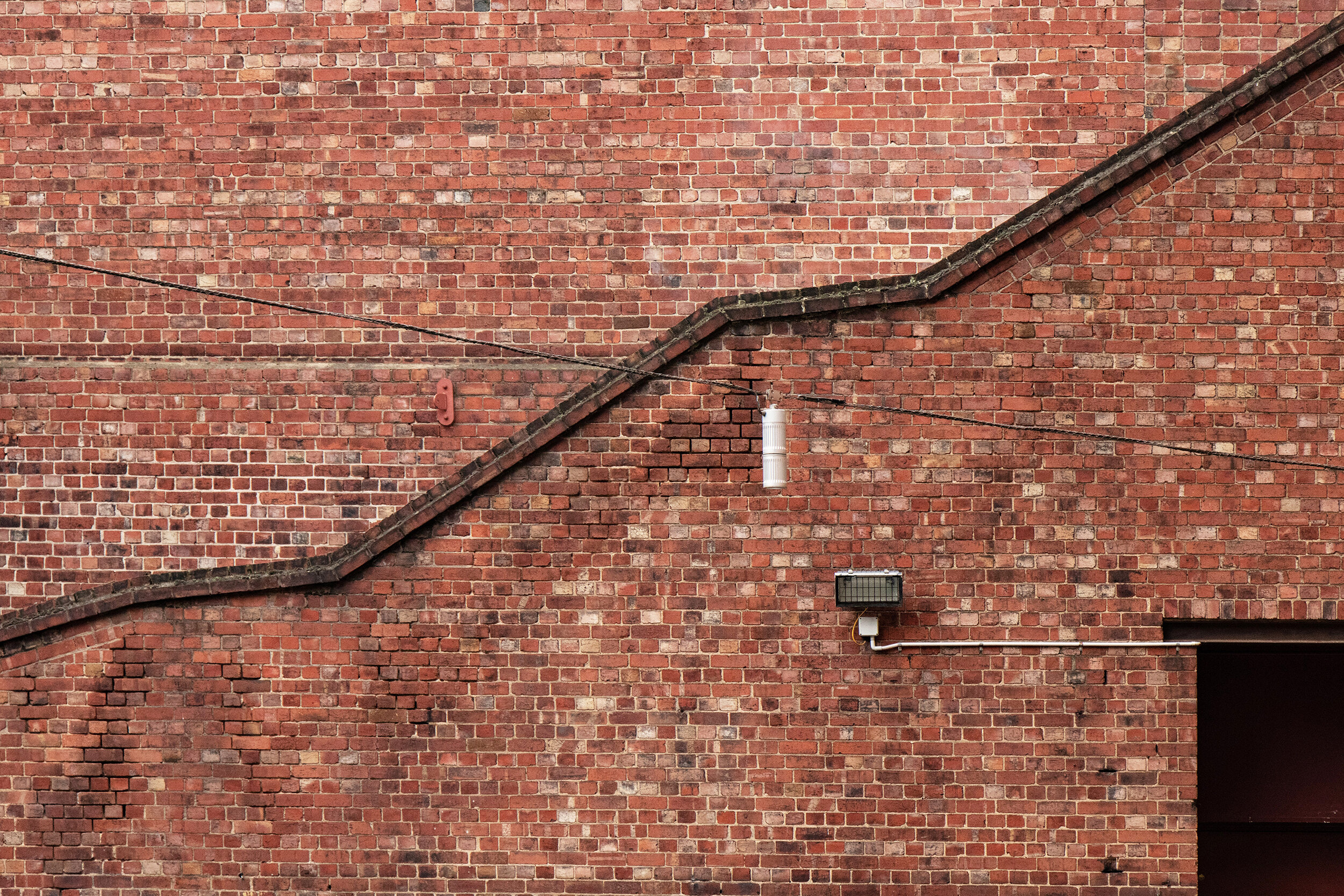
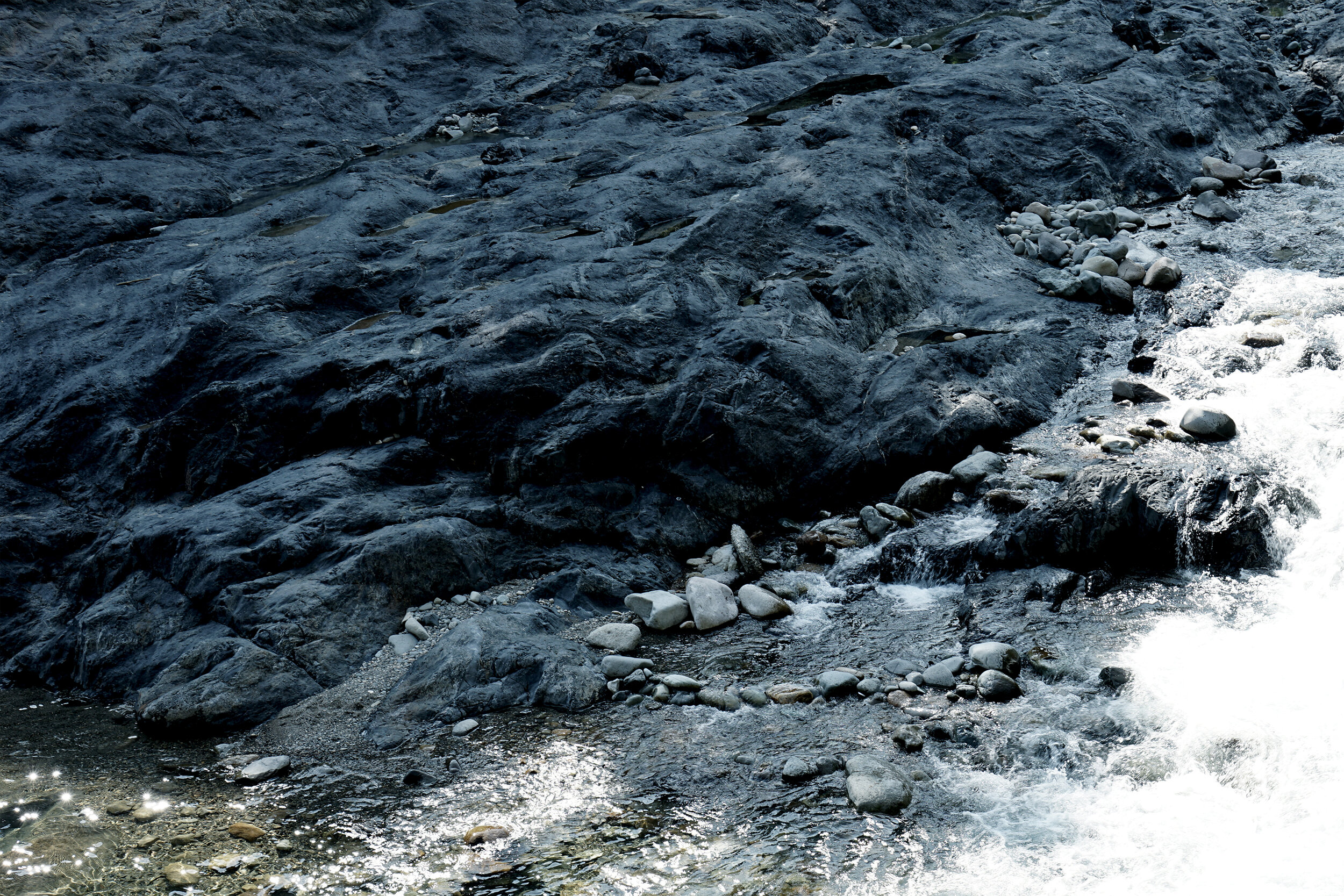
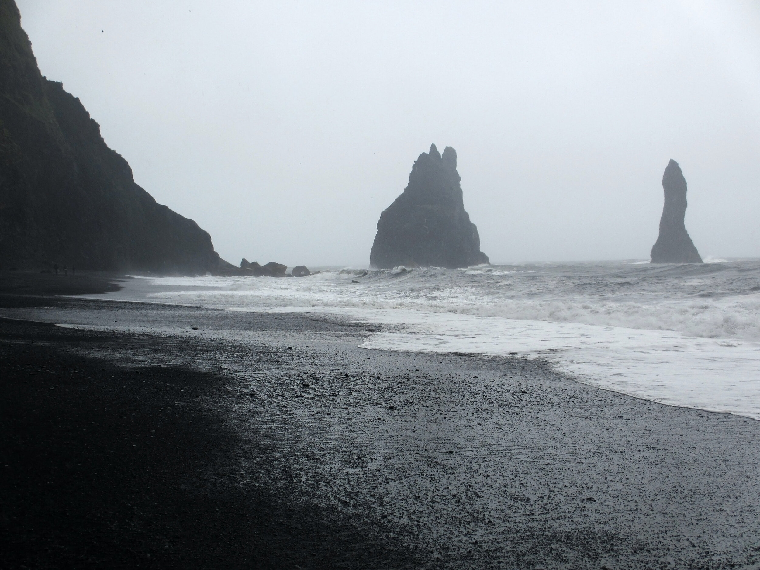
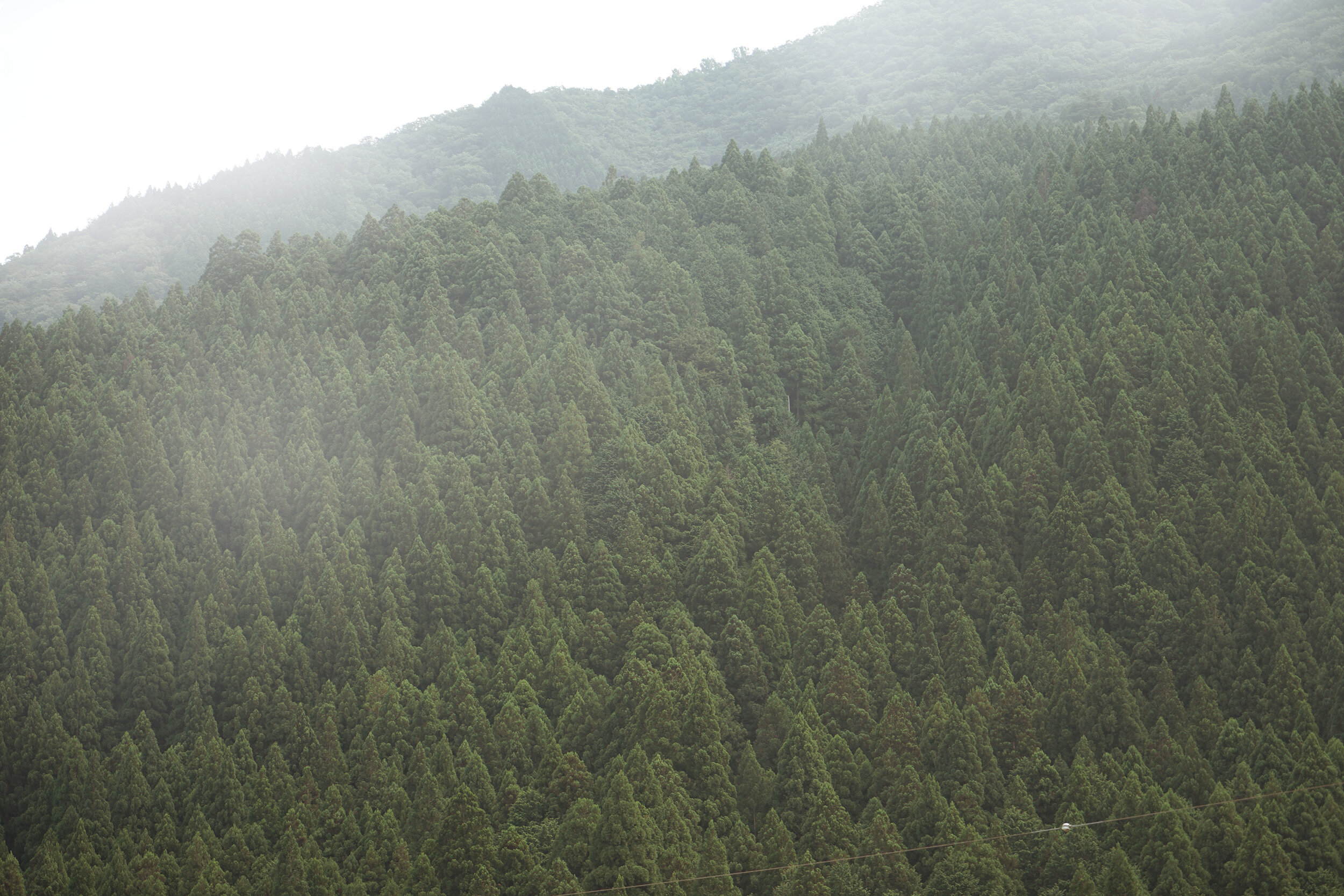
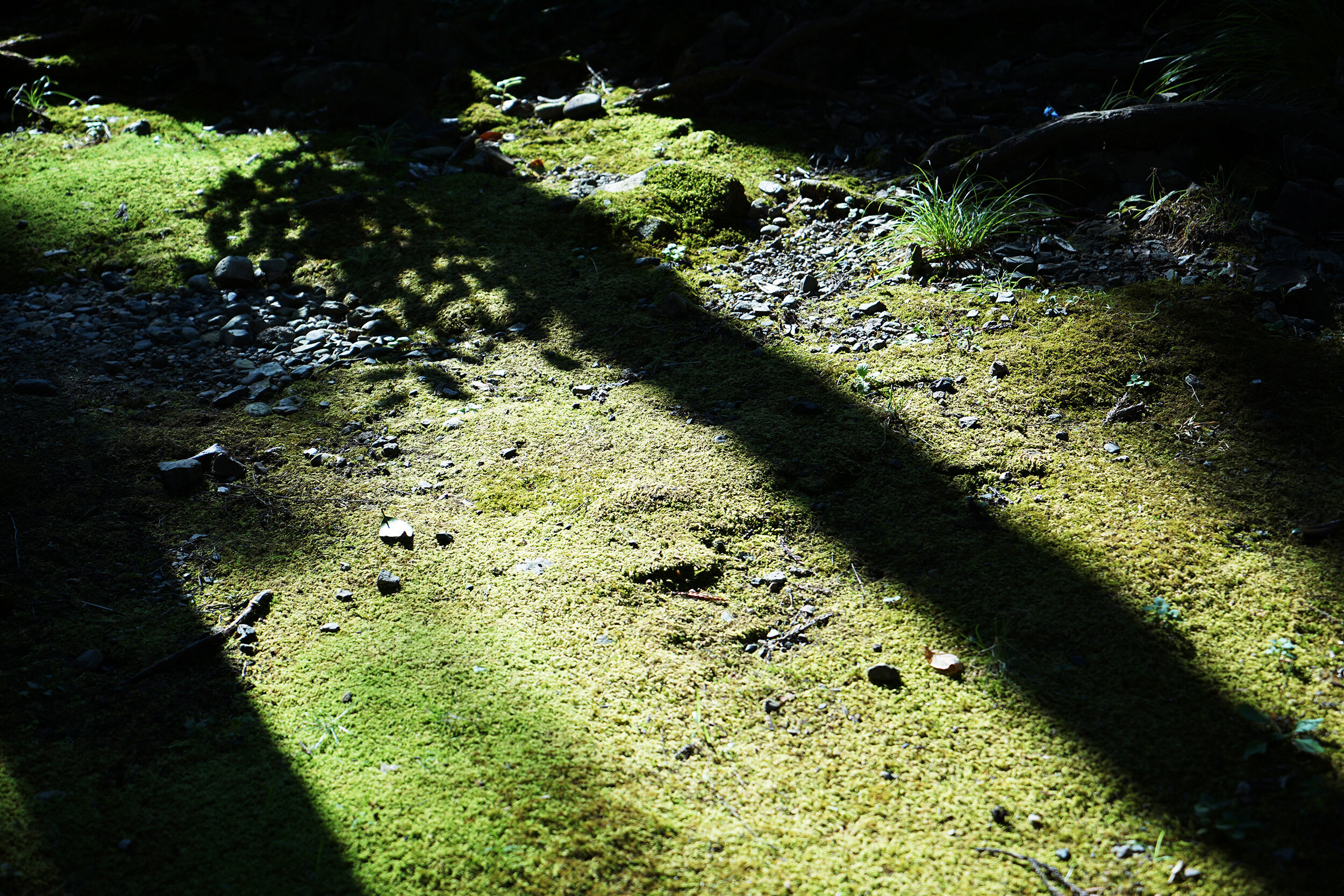
Landscape photo by : Ryota Yokozeki
Nostalgic hue
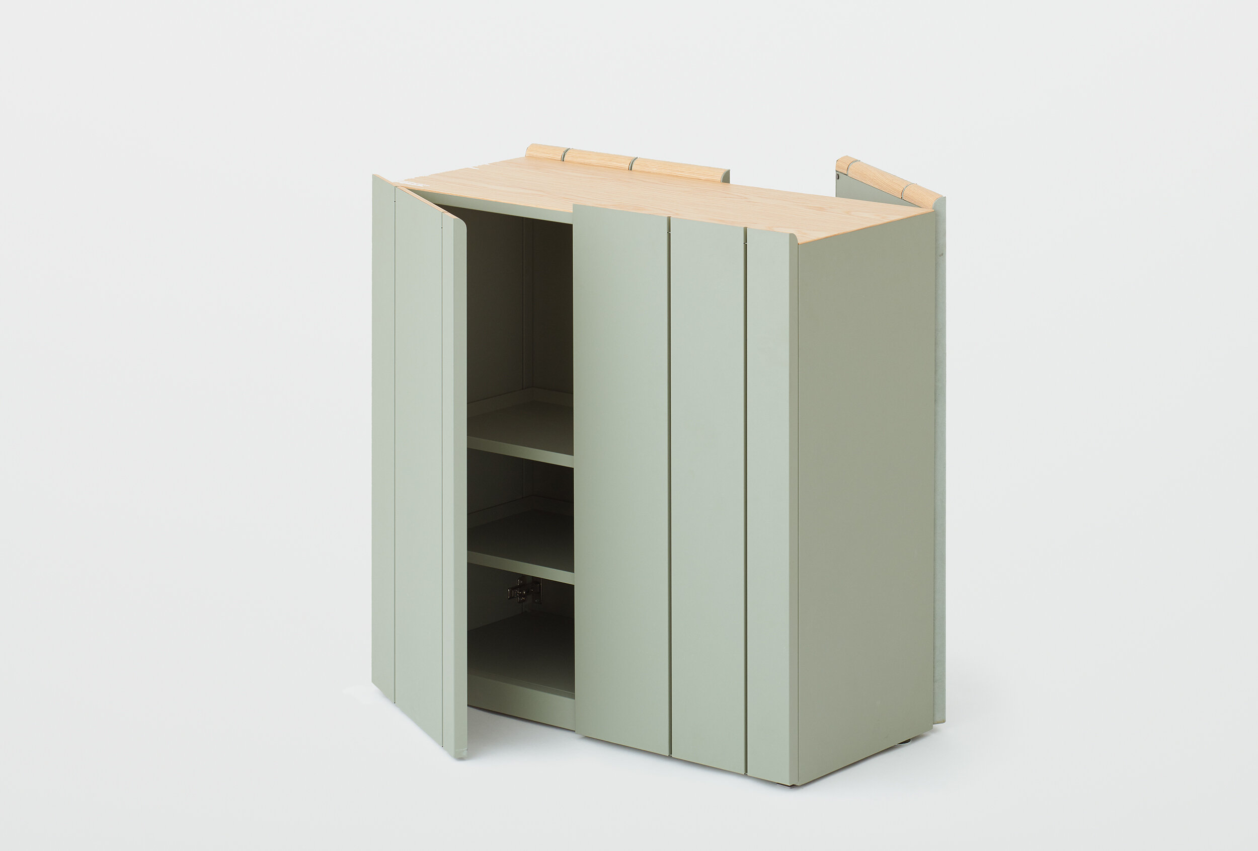
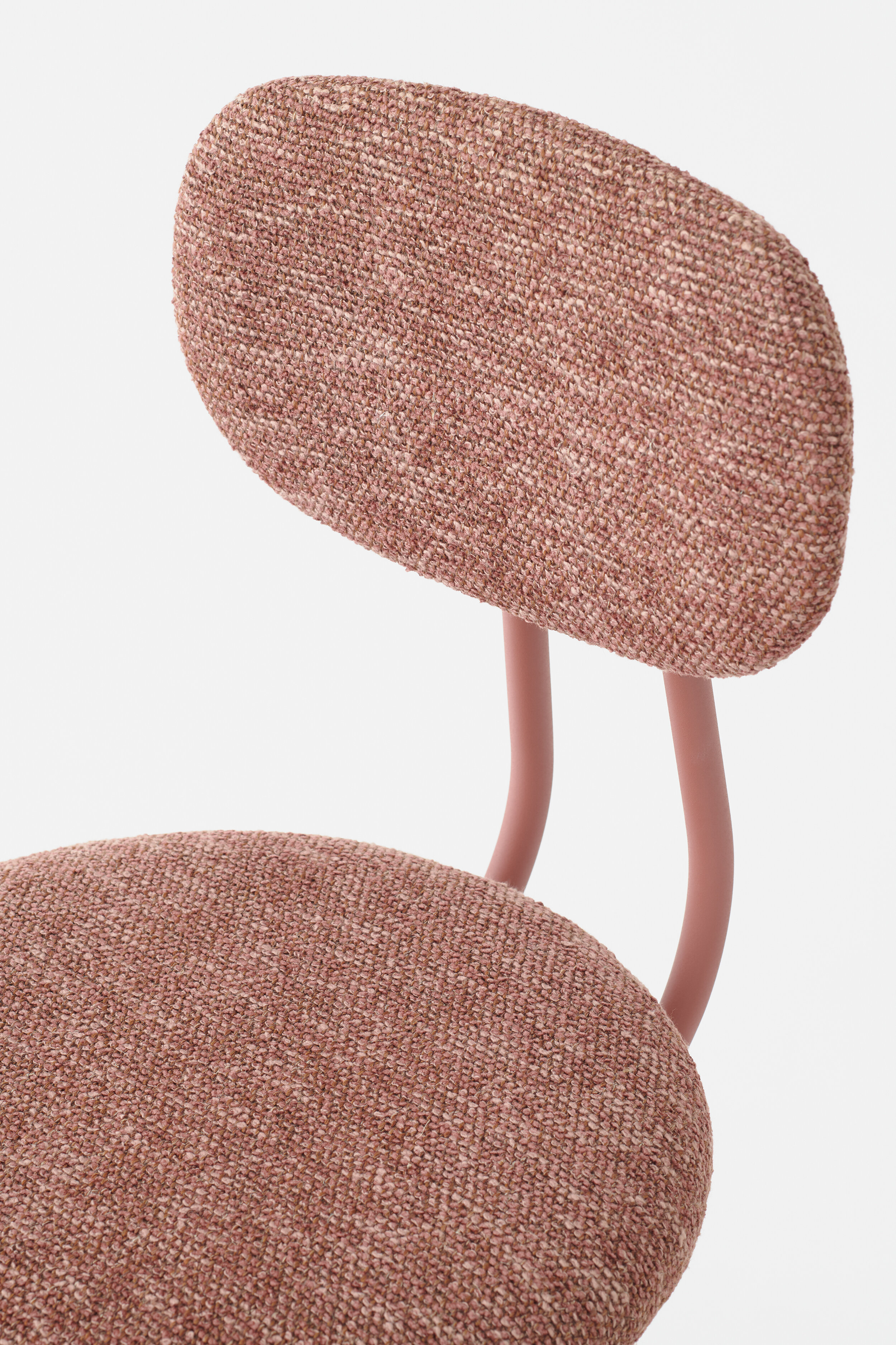
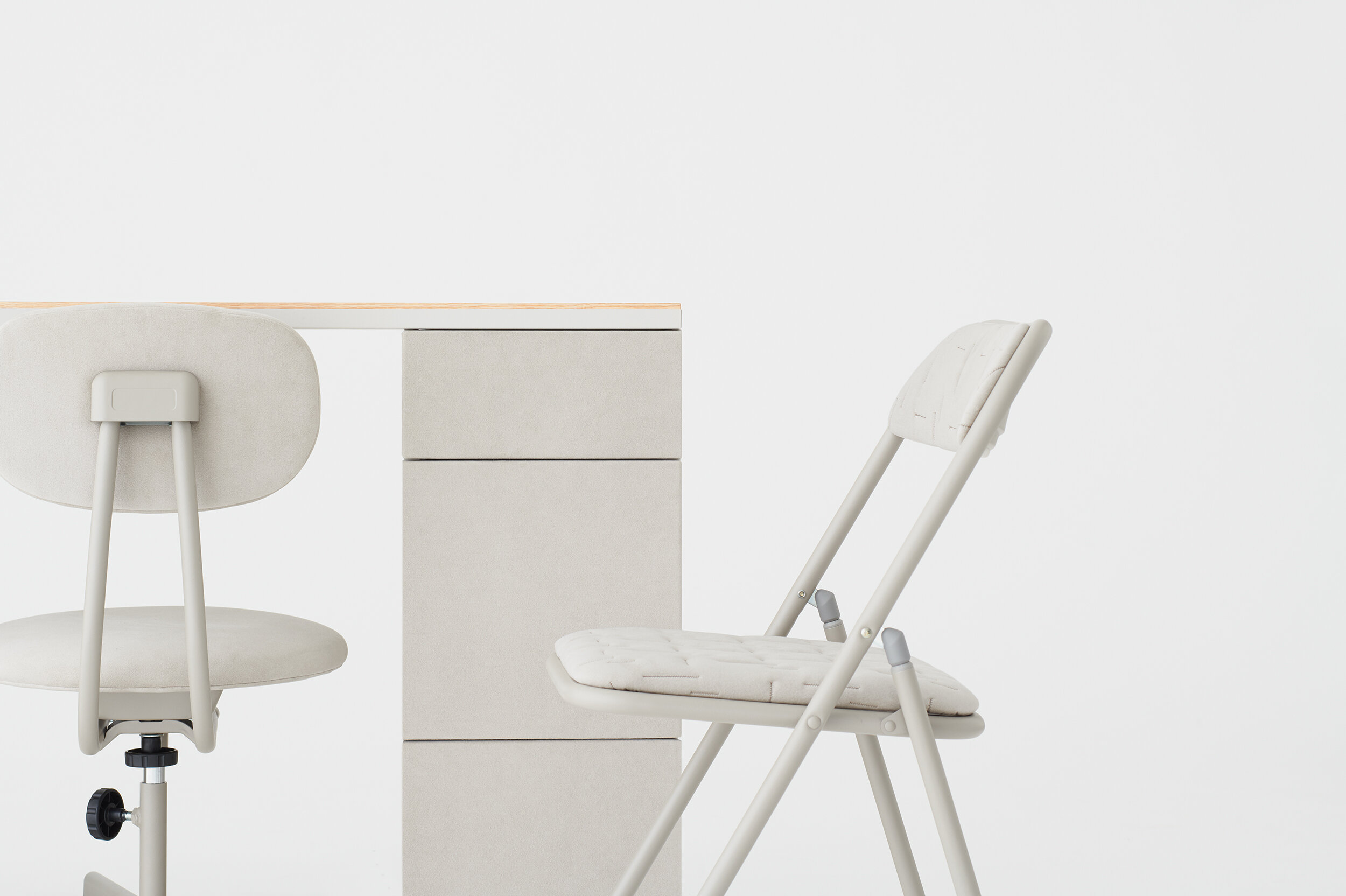
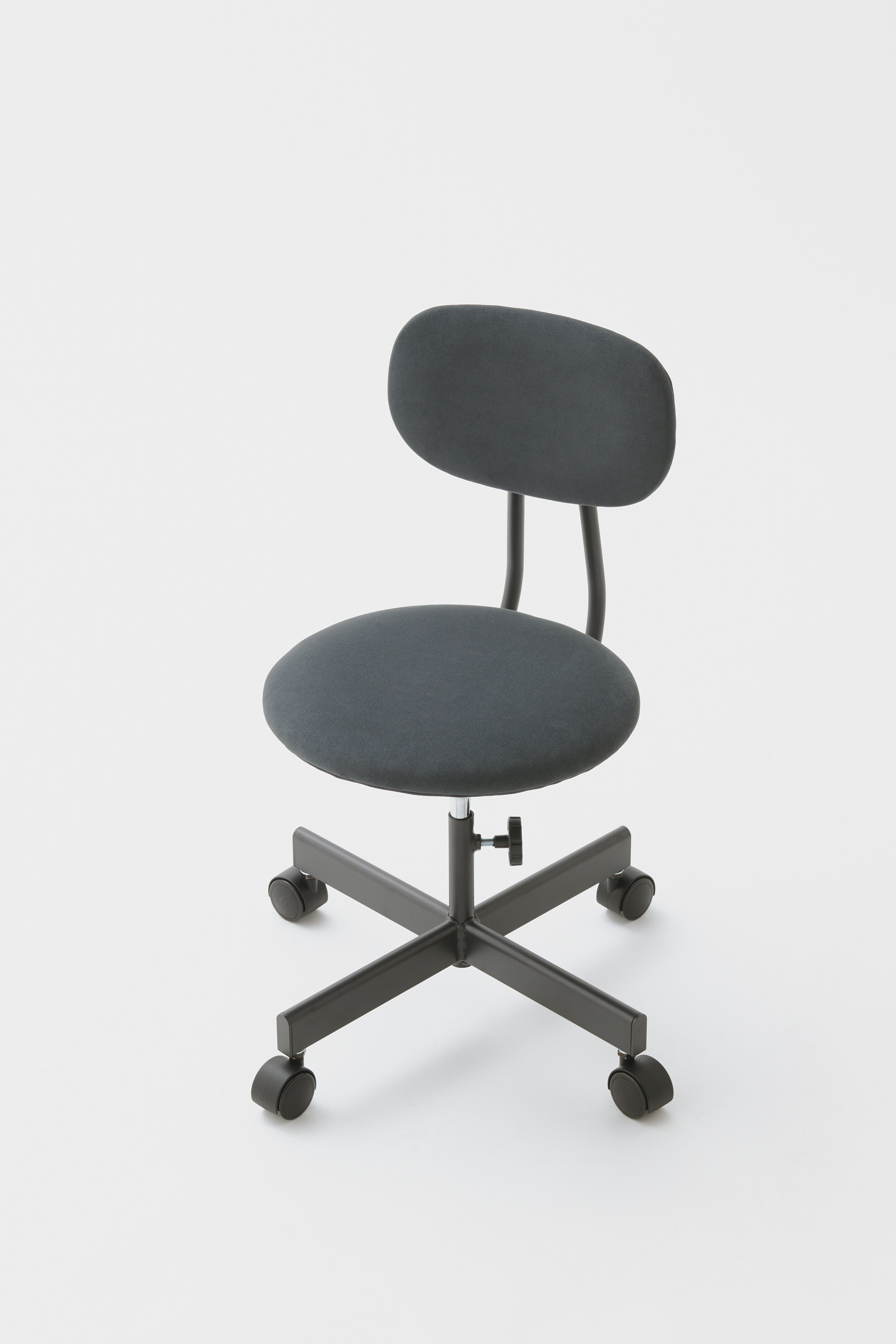
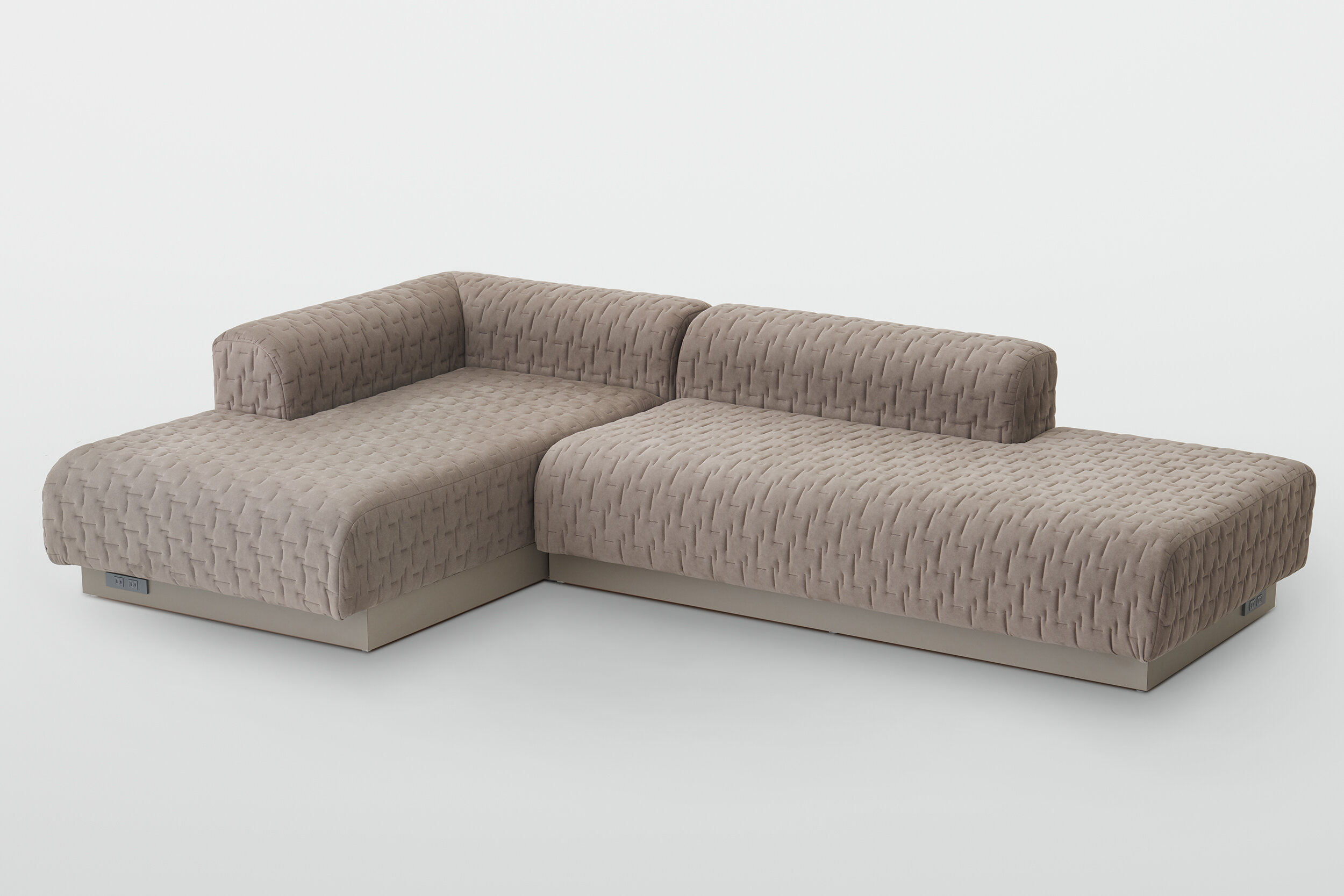
In designing the 1518 1st collection, I did the total color direction of the furniture. Manufacturers in the office furniture industry repeatedly discussed what kind of world view they would create in the future as they sell new products to home offices.
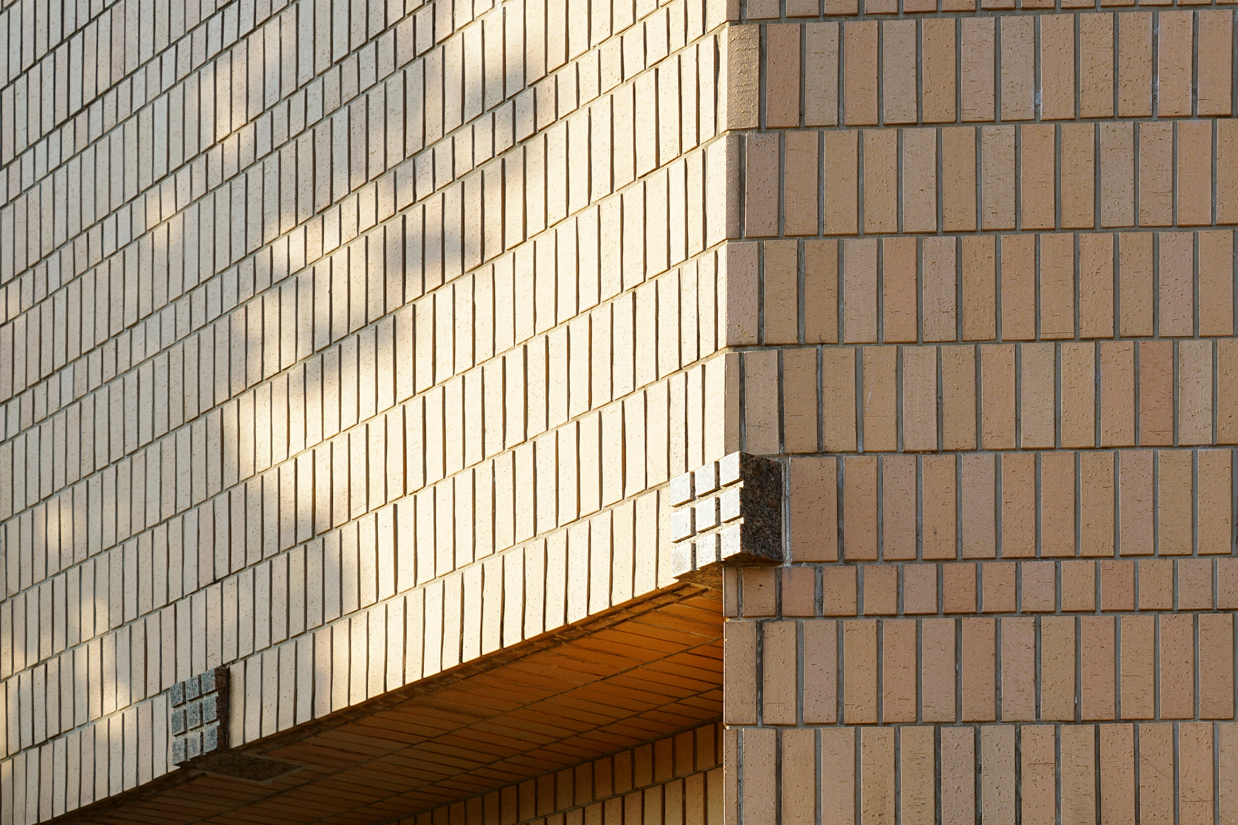
I noticed that the calming and beautiful scenery in my memory has many beautiful common images that everyone can think of. We aimed to create a timeless and calm interior color scheme by incorporating the color "Nostalgic hue" that comes from the scenery of that memory into the furniture. Many of the landscape photographs this time are color hunting of the scenery of Gifu prefecture, the designer's own hometown.
We have newly developed everything from powder coating of steel to fabrics and plastic parts, and improved the product quality by matching with one tone color. In addition, by aiming for a timeless standard color that is not bound by fashion, it will be possible to standardize paints among manufacturers and improve cost performance in the near future. To that end, we are currently promoting the development of the factory line.
1518 1st collectionをデザインするにあたり、家具のトータルカラーディレクションをした。
オフィス家具業界のメーカー達が、あらたにホームオフィスに向け新商品を売っていくにあたり、今後競合の中でどんな世界観を打ち出していくかを繰り返し議論した。
記憶の中にある心を落ち着かせる美しい景色は、誰もが思い浮かべる美しい共通イメージが多くあることに気がついた。その記憶の景色からくる色「Nostalgic hue」を家具に取り入れることで、タイムレスかつ落ち着いた質感のインテリアカラースキームを演出することを目指した。今回の風景写真の多くは、デザイナー自身の故郷である岐阜県の景色を彼自身がカラーハンティングしてきたものである。
スチールの粉体塗装からファブリックやプラスチックパーツに至るまで新たに開発し、ワントーンカラーで合わせることで商品クオリティをアップさせた。また流行にとらわれないタイムレスな定番カラーを目指すことで、近い将来メーカー間で塗料を共通化しコストパフォーマンスをあげることできる。それに向けて現在工場ラインの整備を推進している。